Businesses are increasingly relying on data. The importance of tracking, measuring, and analyzing every interaction has come to the fore. However, an overabundance of data can quickly become a handicap if it is not exploited or used correctly. In response, many data visualization tools (or DataViz) have emerged. These tools allow companies to image their data, in order to share important analyzes internally or with their customers and their communities.
What is Data Visualization?
Data visualization tools are the answer to BigData to provide professionals with the means to create visual representations of large data sets, in order to better understand and assimilate them.
And when it comes to datasets that include hundreds of thousands or millions of data, it makes the job of analysis much easier!

These visualizations can then be used for a variety of purposes: dashboards, annual reports, infographics, sales and marketing documents, and virtually anywhere else information needs to be interpreted immediately.
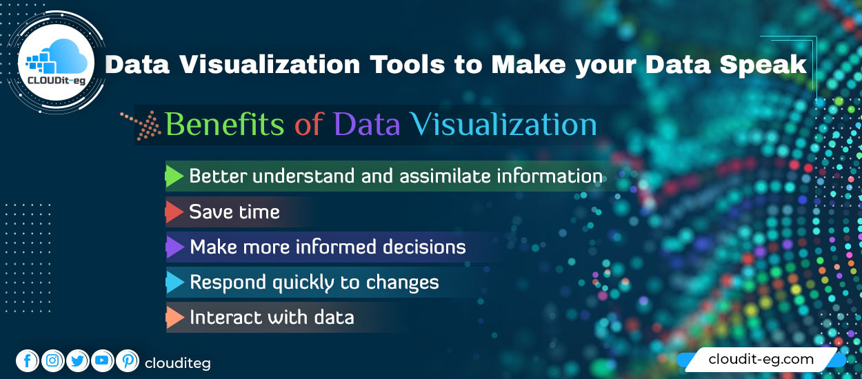
Benefits of Data Visualization
1. Better understand and assimilate information
The human brain tends to process visual information much more easily than written information. Data visualization is the use of these natural skills to improve the efficiency of processing and organizing data.
Furthermore, Using a table or graph to summarize complex data ensures faster understanding than long articles or cluttered Excel files.
2. Save time
Dataviz charts and dashboards allow you and your audience to analyze huge amounts of information from all over the world, in seconds automatically.
3. Make more informed decisions
The visual clarity of your campaign’s results – what works, what doesn’t – helps you quickly identify information that will allow you to better plan your strategy and becomes more efficient.
4. Respond quickly to changes
DataViz tools can provide real-time information that’s easier to assess for stakeholders across the enterprise.
in the same way, These analyzes give you the keys to react more quickly to changes in your market and identify new opportunities. Speed and proactivity in the face of change is a competitive advantage in any industry.
5. Interact with data
Unlike static charts, interactive analytics and dashboards encourage users to explore and manipulate the data to dig deeper and discover the different factors that influence observed data.
Data Visualization use cases
1. Analyze trends in real-time and perform predictive analyzes
DataViz lets you compare multiple metrics over different time periods, helping you quickly get a visual overview of trends over time.
This allows you to spot changes, anomalies, and similarities in real-time in your data about your customers and your market.
When faced with a visual, it’s easier to see patterns in your data. This will allow you to focus on areas that may influence your business performance.
2. Monitor and optimize the performance of your campaigns
By viewing the performance indicators of your campaigns such as your web traffic, media impact, social mentions, or conversions, you get an overview of the performance of your digital marketing campaigns.
This will help you to measure and share your results, but above all to identify areas for improvement to obtain even better results.
3. Analyze customer behavior
By analyzing both internal data on your customers’ interactions, and external data (social media, customer review sites) on what your customers are posting about your brand and your products, you will have a complete view of sentiment and the behavior of your consumers.
4. Provide analysis to your management and other teams
Data visualization greatly facilitates knowledge sharing within your company.
For example, you can bring together the high-level analytics important to your management, without them having to sift through a huge amount of data to find what is important.
You can also share your customer-related data with your Customer Relations teams, or even your competitors and sector analyses with your Business Development and Business Intelligence teams.
5. Create visual and engaging content
By turning your data visualizations into infographics or interactive charts, you can deliver original, usually highly engaging, content to your customers or social media audiences.
6. Make connections
One of the benefits of data visualization is that it allows users to follow the links between operations and business performance.
Finding a correlation between sales or marketing functions and market performance is essential in a competitive environment, especially for large companies.
Three examples of DataViz
Depending on your purpose and the information you want to highlight, the type of chart you use will not be the same. Here are some types of visualization to guide you in your decision-making.
To compare data
When you want to compare the differences and similarities between several sets of data, charts are ideal for revealing the high and low values of a particular set. You can thus note major differences, gaps, and other trends.
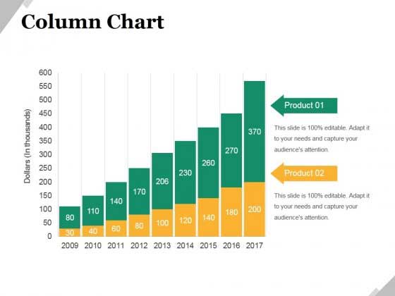
For example, you can use columns, lines, or bullet charts to create comparative analyzes.
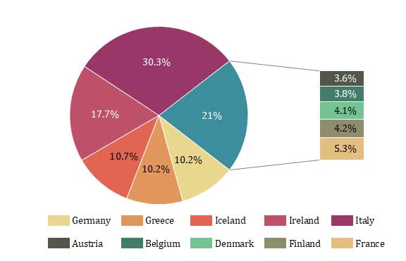
To analyze the composition of a dataset
For separating and segmenting your data sets, to represent the proportion of men and women in your customer base, for example, pie charts are a good choice.
To find trends
Do you need to take a step back on all your data to identify major trends?
Word cloud graphics are a good way to highlight redundancies in your data.
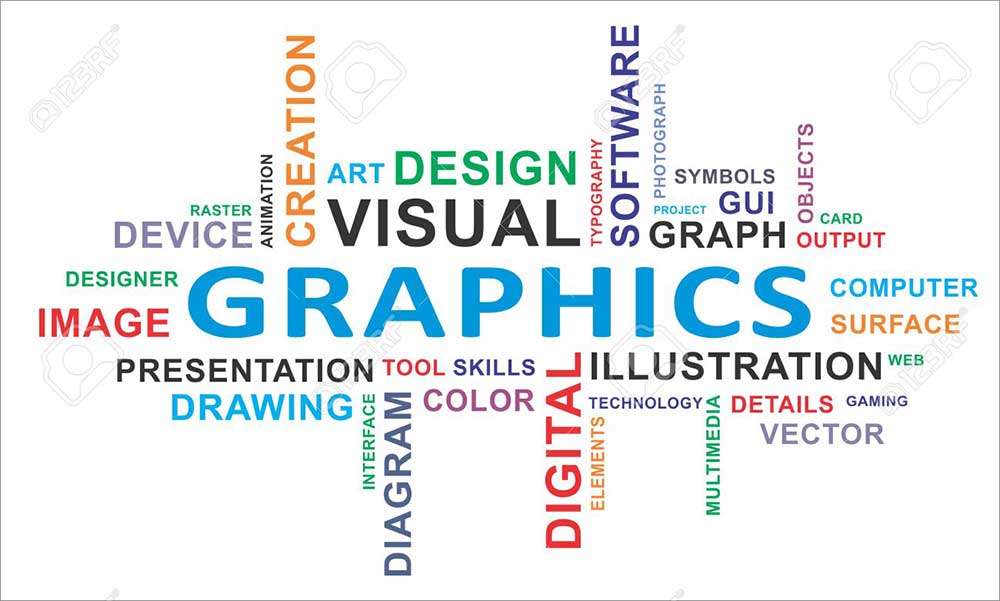
For example, a word cloud applied to your social media mentions can help you identify the hashtags or emojis most associated with your brand.
How to choose your data visualization tool?
1. The right questions to ask yourself
Define your goal
Before embarking on tool research, you should first identify the goals you are looking to achieve with this type of tool.
Is it for reporting on your business performance or to find trends spanning your entire market?
Identify your skills
There are DataViz tools suitable for all levels of data analysis. Some are designed to be as accessible as possible, others reserved for people with advanced technical skills.
Study the data you want to visualize
What is the volume of the database that you want to analyze? Is this data internal or external to your company? What processing and alignment are necessary on your data in order to visualize them?
Define internally the users of these tools
Who will create the analyzes? Who will receive them? How will these be shared within your company?
2. The criteria to be taken into account
Ease of handling
There are some incredibly complex tools for visualizing data. Some have documentation and tutorials to help you, others are directly designed to be as intuitive as possible.
Data processed
Can the tool manage multiple datasets in a single visualization?
The scope of possible analyzes
The best tools can produce a wide variety of diagrams, charts, and maps.
Interoperability
Can you easily connect other data sources? For example, does the tool allow you to import raw data from your CRM or from Excel and CSV files?
The possibility of exports
Can you publish your visualizations to the web, convert them to PDF, or integrate them into other applications through an API?
The price
Obviously, the price comes into consideration and especially the factors which impact it (volume of data, number of simultaneous analyzes, number of users, etc.).
Customer support
Does the tool offer training during subscription? Or dedicated customer support in case of problems? Through what channels can you reach this support?
5 Free Data Visualization Tools
There are many data-visualization tools. Among the best known, we find Tableau or Microsoft Power BI, which allows you to easily integrate and analyze a lot of data. We can also cite data storytelling tools such as Toucan Toco.
To help you navigate it, we’ve put together a list of free and easy-to-use data visualization tools that will help you transform your data and get you started with the discipline.
Open Refine
Open Refine is a free, open-source tool that lets you easily explore large datasets, clean and transform data and reconcile and match your data.
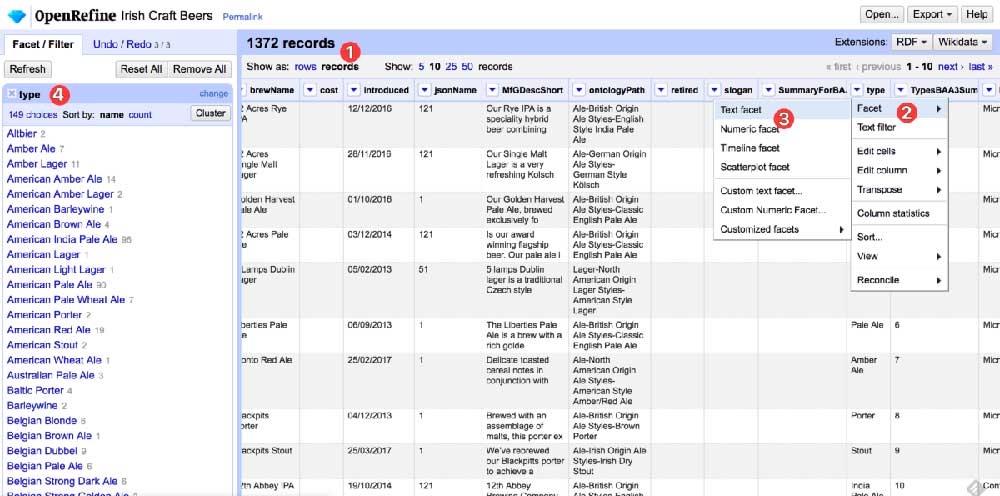
Data transformation is usually a painstaking process, so if you end up with messy and mismatched data and need help, Open Refine is for you.
Charted
Charted is a tool that aims to transform your data into visualization in a minimum of steps. Also, it automatically creates data visualizations using linked files and turns them into clean, shareable graphics.
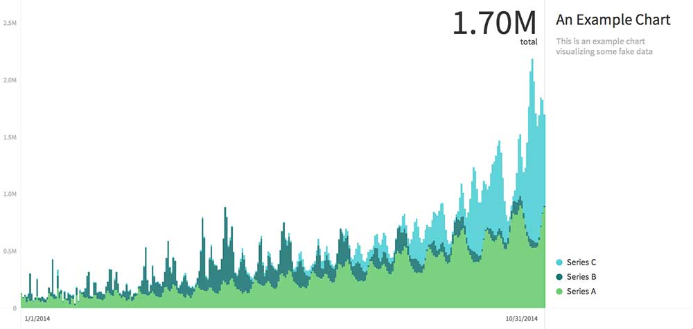
By focusing only on the visualization stage, Charted is perfect for data sets that display well in a simple row or stacked column charts. While Charted doesn’t store or manipulate any data, it refreshes every 30 minutes to keep your charts up to date.
WebDataRocks
WebDataRocks is a pivot table that enables data analysis and visualization by integrating and analyzing complex data.
Wrapped in a modern user interface, the PivotTable quickly groups data and displays information in real-time.
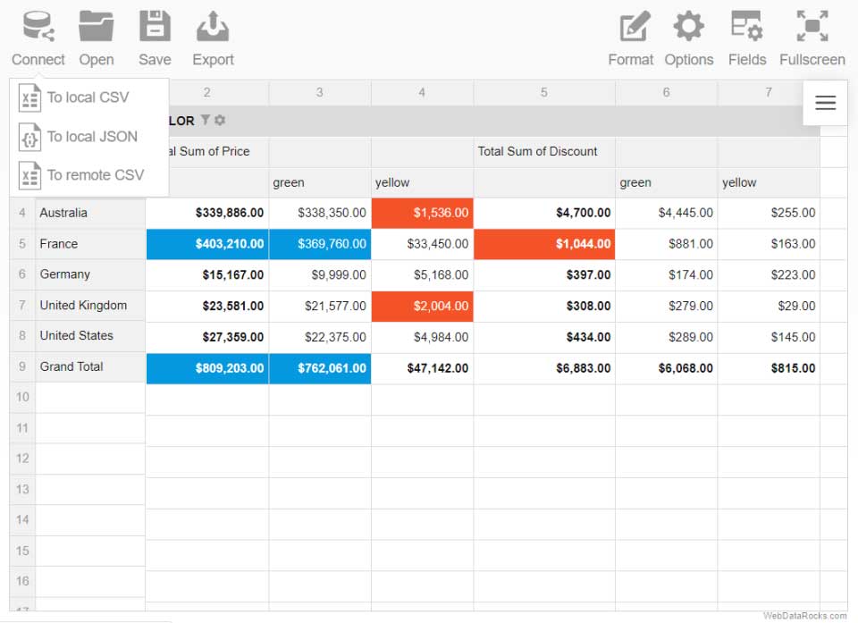
After uploading a CSV or JSON file, users can instantly see, understand, and interact with their data.
Information is Beautiful
Information is Beautiful is a library of pre-built data visualizations. Visualizations are constantly updated, revised, and rotated to reflect accuracy and the current climate.
Information is Beautiful’s mission is to help the public make more informed decisions and therefore everything is downloadable. These visualizations are an easy way to add striking and informative visuals to internal presentations.
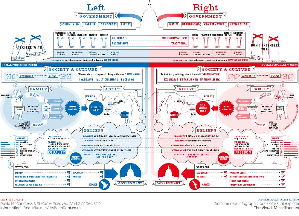
Be sure to check their license agreements, however, as while they give free access to individuals, they are chargeable for commercial uses.
Google Charts
Google Charts is an easy-to-use online application that allows users to visually display data on their website.
By using simple JavaScript integrated into the web page, users have full control over the appearance of their data. Charts are highly customizable and can as well range from simple plots to extremely hierarchical trees. They can also be enhanced with interactive elements like animations.
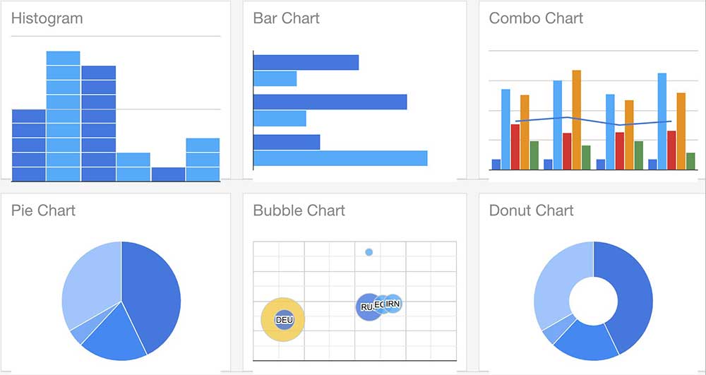
On the whole, there is an extensive library of examples to inspire you, which makes it much easier to get started.
